4 Easy Tweaks to Make Your Content Upgrade Stand Out!
One of the most valuable tools that I use to grow my business and email list is content upgrades. By utilizing content upgrades, I’ve been able to grow my list to almost 5K subscribers and have been able to book clients using my email list. Content upgrades can work in almost any niche, they’re valuable to your readers and most of all will keep readers coming back!
What are content upgrades and how can they help you gain more traffic, increase your sales and build a loyal email list? Content upgrades are post-specific and are normally something that you offer your readers in exchange for an email.
Great content upgrades are the next logical step for your audience, ex. If you write a post on how to check a home for any problems before purchasing, a content upgrade would be providing them with a specific checklist that they can use. The content upgrade is logical, makes sense, and is valuable!
There are many types of content upgrades that you can use:
Training video
Infographics
Ebooks
Printables
Challenges
Transcripts
Cheatsheets
The possibilities are endless! Content upgrades can be anything that will resonate with your audience and help them achieve something- it’s anything that can be valuable.
Here are some things to consider when creating your content upgrade:
1. Your content upgrade has to MAKE SENSE to the reader
If I read an article about meal prepping and at the bottom of the post, there’s an opt-in to get your ebook on “10 ways to be a better blogger” I wouldn’t opt in. Why would I? I’m here to learn about meal prepping, I’m not interested in learning how to be a better blogger. Before creating your content upgrade, think about the next steps that your reader would take to achieve their goal. Let’s say they’re learning how to use social media to gain traffic, they would first read your blog post, then what?
Make it easy for your reader to achieve their goals or get to where they want to be:
Step 1: They read your blog post, “Social Media 101”
Step 2: They see your content upgrade: “Social Media Sizing Cheat Sheets” or “Social Media Content Calendar Template”
Step 3: They opt-in to receive your template or cheatsheet.
From there, you’ll know that they are interested in social media strategy and can properly market your services to them, whether it’s an advanced template, social media course, or even social media design services.
Action steps:
Think about the next step the reader can take to put your blog post into action
Would a checklist help them? Or, if your blog post is techier, can you offer them a recorded tutorial instead?
Example: heleneinbetween has a blog post titled, “ HOW AND WHY TO CREATE FOUNDATIONAL CONTENT (GROW YOUR BLOG SERIES)” and offers a 7-page workbook that shows readers how to create their own content.
2. Make downloading the content upgrade easy and obvious.
Ah, I made this mistake when I created my first content upgrade ever. My content upgrade had all the right things going for it, I made sure that it was on topic, had a wonderful checklist created, and made sure to promote the blog post. The blog post got over 1,000 shares and is one of my most popular blog posts to date, but yet I only had 2 subscribers.
So, what happened? I didn’t design the graphic with my audience in mind.
This was my old graphic, it just said, “Download the guide” I thought it was pretty straightforward and my readers would simply know to click on the graphic and grab the freebie… WRONG!
Some of my readers were brand new bloggers who weren’t techy and didn’t realize that the one graphic I posted was a clickable link. They saw the image, but never clicked on it. When designing your content upgrade, make sure to include words like, “click here to download” or “download here!”
Your content has to stand out! A great way is to make sure it contrasts with the page or has a great-looking CTA (Call To Action) Button!
This opt-in by Megan Minns is the perfect example of how contrast plays a major role in grabbing a reader’s attention.
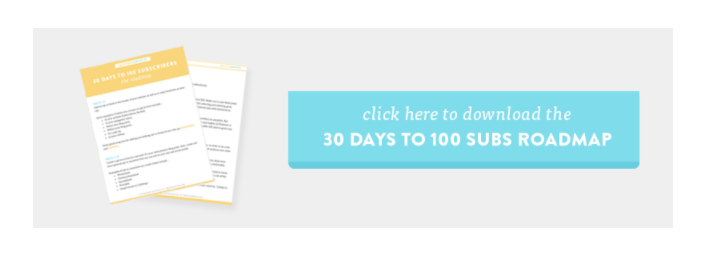
Here’s another great example from one of the biggest bloggers out there (and one of my favorites!) Melyssa Griffin. See how her graphics have a great CTA and let her readers know that they can click on the image to download her 30 Days to 100 Subs Roadmap!
Here’s the last example of a wonderfully designed opt-in by Sarah from Wonderland.
3. Give your readers more than one way to opt-in:
Another important thing to remember is that you need to share your content upgrade in different ways. This means that you should include a graphic, and also include some text links as well. Once I began to add in-text links AND a graphic to my blog post, I had a huge increase in email subscribers!
Remember, the easier you make it for your reader to get what they need/want, the better. You don’t want them to have to spend more than a few seconds to find your opt-in or
4. Remind them throughout the blog post
You can add different text links and graphics throughout your blog post, but do not make it cluttered. You have to strategically place them in a way that makes sense and makes the user want to click. I normally like to have one main graphic but you can definitely be a bit more generous with your text links as they don’t take too much space and can be scattered throughout the blog post.
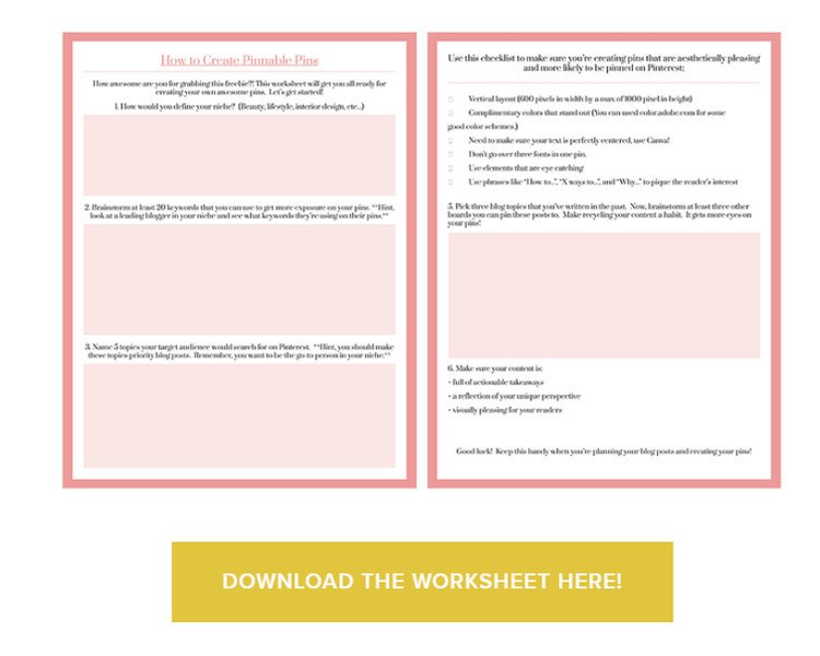
The best places to put the content upgrades would be at the very top, the middle, and the very bottom. I like to start off my blog post by saying something like, “PSSST, download the worksheet HERE so you can fill it out as you read the blog post.”
Towards the end of the blog post is when you can go all out (in a tasteful way, of course!). I like to put the graphic at the end and say, “Loved this post? Download the free guide here!” If someone has taken the time to read the WHOLE blog post, then most of the time they will opt-in.
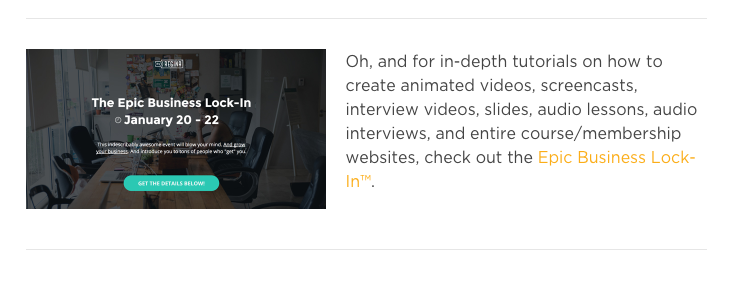
Love these two different designs from Regina that advertise her Business Lock-In, she offers two different ways to opt-in. One of them is a text link and the other is an eye-catching graphic on her sidebar.
Different examples of content upgrades for different niches:
-> Food Blogger: Maybe you’ve written about how important it is to use a grocery shopping list while shopping so that shoppers can save money and stay focused. Why not offer a content upgrade of the food shopping list?
-> Health Blogger: Maybe you’ve written a post on the importance of meal prepping and its benefits of it. You can include a content upgrade on a meal prep worksheet or even an infographic.
-> Entrepreneur: Your number one post is, “How to set up a social media strategy that will gain you tons of followers in 5 days”. Add in a content upgrade of a template or something editable that your audience can use.
-> Real Estate: Let’s say you wrote about the importance of checking your potential house thoroughly to make sure that everything works fine. Include a checklist of the most important things they should check, people are then able to print it out and bring it along upon their house inspection.
See, the possibilities are endless!


